
When discussing lighting color for an art studio, color temperature and color rendering are the two most critical metrics to be aware of. In this article, we explain what the Color Rendering Index (CRI) is, and why a high CRI rating is crucial for art studio lighting applications.
What is CRI?
Color Rendering Index (CRI) describes a light source's ability to reveal an objects' colors as they would appear under natural light. An LED bulb with a low CRI value (less than 80) would cause colors to appear quite different from how they would appear under natural light, while another LED bulb with a high CRI value (95 or higher) would show these colors very similarly to how they would appear under natural light.
For an art studio, we can essentially understand the CRI value of a light bulb as a measure of how accurate objects' colors appear, when compared to the natural daylight that shines in through a window.
It should go without saying, that as an artist, you want to make sure that the colors you see under natural daylight are an exact match with the colors you see under your light bulbs.
How is CRI different from color temperature (CCT)?
CRI and color temperature (commonly abbreviated CCT, for correlated color temperature) both are concerned with light color, so the two concepts can be easy to mix up! They are independent concepts however, so care must be taken to ensure you are getting both the correct color temperature as well as CRI for your art studio.
As we discussed in the previous section, CRI explains how objects' colors appear under a light source. The color temperature, on the other hand, explains how the light color itself appears.
As an example, let's say a light bulb has a 6500K color temperature rating but a low CRI rating of only 80. The 6500K tells us the color of the light output, and incidentally, 6500K perfectly matches daylight in terms of how the light color appears.
If you shine the 6500K light bulb against a neutral background, you will actually not be able to distinguish it from natural daylight, despite its low CRI rating.
Now, if you take that same light bulb and shine in onto your canvas, you will notice some significant differences in color appearance when compared to natural daylight. Red colors, especially, may appear dull, washed out or even brown.
In other words, differences in CRI are noticeable only after the light shines onto a colored surface and reflects light into our eyes. If you think back to grade school when we learned how color works, this all makes sense; after all, color is the result of the light that is not absorbed by an object, and instead bounces off and into our eyes.
Color temperature and CRI are two separate metrics, and for art studios in particular, you'll want to be sure that you select lighting products with both:
- the correct color temperature (daylight - 5000K or 6500K), and
- a sufficiently high CRI rating of 95 or higher.
What is CRI R9?
In addition to the standard CRI, there is another, related metric called CRI R9, which measures color rendering for red colors in particular. Red colors and pigments are the lifeblood of color far beyond colors that appear red; brown, pink and magenta colors all have a significant red color component whose appearance can be distorted by a low CRI R9 value light source.
To better understand the CRI R9 metric, it may be helpful to learn the basic premise of how CRI is calculated. CRI is actually a calculated value based on the measured light spectrum of a light source. Once the light source's spectrum is measured, the algorithm simulates the perceived color appearance of 15 different color swatches and records the apparent color for each of these swatches.
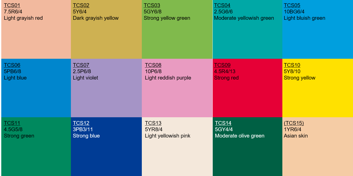
The algorithm then repeats the process, but this time uses the standardized light spectrum for natural daylight. The calculated results of the 15 swatch colors are then compared between the light source and natural daylight; the average of only the first 8 color swatches are then used in calculating the CRI value.
What about the remaining 7 color swatches? The last 7 color swatches are considered supplemental colors, which were (incorrectly, in our opinion) deemed to be less commonly encountered in everyday life.
In particular the 9th color swatch - the deep red, R9 swatch - is one that is very telling in terms of a light source's color rendering abilities that goes beyond just the simple CRI value.
What are acceptable CRI and CRI R9 values for art studios?
CRI values have a maximum value of 100, with 100 being the best, or most similar to how colors appear under natural daylight. It is not scaled intuitively such that the numbers correspond to percentages or grades, so it can be a bit difficult to know what is a sufficiently high CRI value for art studios.
That being said, we generally recommend using lighting products with a CRI value of 95 or higher. If the CRI value is not readily advertised, the CRI is likely closer to 80 or below, so you'll definitely want to avoid such products for an art studio lighting application.
CRI R9 values, just like CRI, have a maximum value of 100. Unlike CRI, however, it is quantitatively more sensitive to minor changes in red color rendering. As a result, we consider R9 values of 80 or higher to be appropriate for art studio applications. Even fewer manufacturers will readily advertise (or even know about) the CRI R9 ratings for their products, so be wary of this when searching for lighting products for your art studio!
What exactly happens with low CRI lighting?
Unfortunately, the vast majority of daylight color temperature lighting products on the market have a low CRI that typically only reaches 80 or so. These products tend to be low-cost and are readily available from your local hardware store, so it can be tempting to simply install them in your art studio. (And, as we mentioned, these products will likely avoid mentioning CRI and CRI R9 in their marketing materials altogether.)
The main concern with low color rendering quality is that you will not be able to accurately see colors. You may have trouble distinguishing between different hues, especially darker shades such as dark brown colors.
Mixing light sources with different color rendering quality can also be problematic from a consistency standpoint. This is because color can appear different, even if both light sources are of the same color temperature. Most commonly, this occurs when low CRI lights are used during evening hours, but then the same artwork is viewed under natural daylight (perfect CRI) during daylight hours.
In conclusion
Color rendering can be a tricky subject owing to its technical methodology as well as the fact that it is simply not discussed extensively in art studio design. Alongside color temperature, however, color rendering is a critical aspect of ensuring that the lighting environment of your art studio is optimized so that you can put your best foot forward when working on your art pieces.